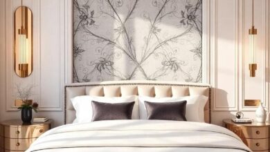
Harmonizing Spaces: Ideal Bedroom Wall Colors to Complement Light Wood Furniture
In the realm of interior design, the bedroom stands as a personal sanctuary, a retreat from the bustling world outside. The aesthetic choices we make within this intimate space can greatly influence our mood and well-being. One of the most pivotal decisions in crafting a serene atmosphere is selecting the right wall color, especially when harmonizing with the natural elegance of light wood furniture.This article delves into the enchanting world of color palettes,exploring how soft hues and subtle shades can elevate your bedroom,creating a cohesive and tranquil habitat. Join us as we uncover the ideal wall colors that not only complement but celebrate the beauty of light wood, transforming your sleeping space into a harmonious haven.
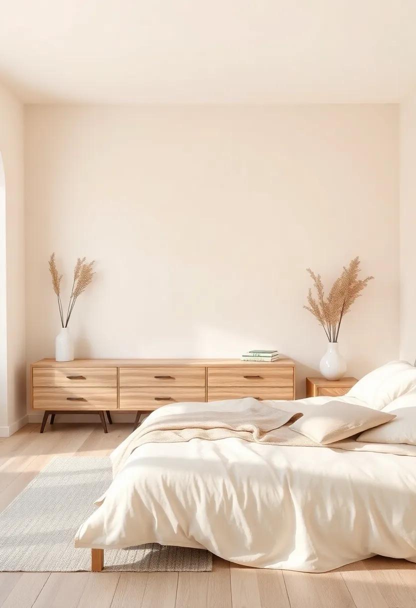
Exploring the Warmth of Soft Beige Tones Against Light Wood Furniture
In the realm of interior design, soft beige tones offer a gentle embrace that beautifully complements light wood furniture. This versatile color palette creates a serene environment, allowing the natural grains of the wood to shine without overwhelming the senses. When paired, these hues can transform a space into a tranquil haven, perfect for relaxation.Consider using soft beige shades on your walls,which can establish a warm backdrop while enhancing the brightness of the room,creating a welcoming atmosphere that invites comfort and peace.
To maximize the appeal of this harmonious combination, you might think about incorporating various textures and accents. Hear are some suggestions to elevate your decor:
- Cushions: Opt for plush cushions in varying shades of beige to add layers of comfort.
- Blankets: Drape soft throws over your bed or seating to introduce warmth and a touch of coziness.
- Artwork: Choose frames in light wood or complementary colors to tie everything together seamlessly.
This curated blend of soft beige tones against light wood furniture not only fosters a cohesive look but also enhances the visual depth of your space,making it a perfect retreat for any modern home.
Embracing Serenity with Calming Pale Blue Shades for Your Bedroom Space
When it comes to creating a peaceful ambiance in your bedroom, pale blue shades emerge as a top choice. These colors evoke the tranquility of a clear sky, imparting a sense of calmness that is essential for restful sleep. Incorporating these soothing hues can transform your bedroom into a serene retreat, perfectly complementing the natural warmth of light wood furniture. The blend of soft blue tones and wood elements creates a harmonious balance, promoting relaxation and a sense of spaciousness. Consider using shades like sky blue, powder blue, or robin’s egg to craft a soothing wall backdrop.
Enhancing your serene atmosphere can be achieved thru thoughtful accent choices. Decorate your space with fabrics and furnishings that echo the calming theme. Here are some ideas for your pale blue sanctuary:
- Textiles: Use bedding and curtains in soft patterns or solid pale blues to drape gentle drapes of tranquility.
- Art: Select framed artwork that features abstract designs or nature scenes in complementary pastel colors.
- Accent pillows: Add plush cushions in varying shades of blue to invite comfort and depth.
To further explore how different shades of pale blue can influence your space, consider this simple comparison:
| shade | Effect | Complement |
|---|---|---|
| Sky Blue | Invigorating yet serene | Warm beige tones |
| Powder Blue | Soft and relaxing | Light gray accents |
| Robin’s Egg | Cheerful and uplifting | Natural wood finishes |
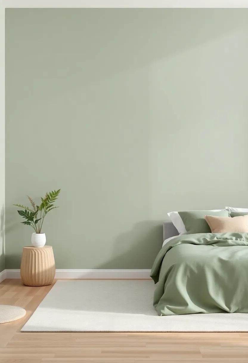
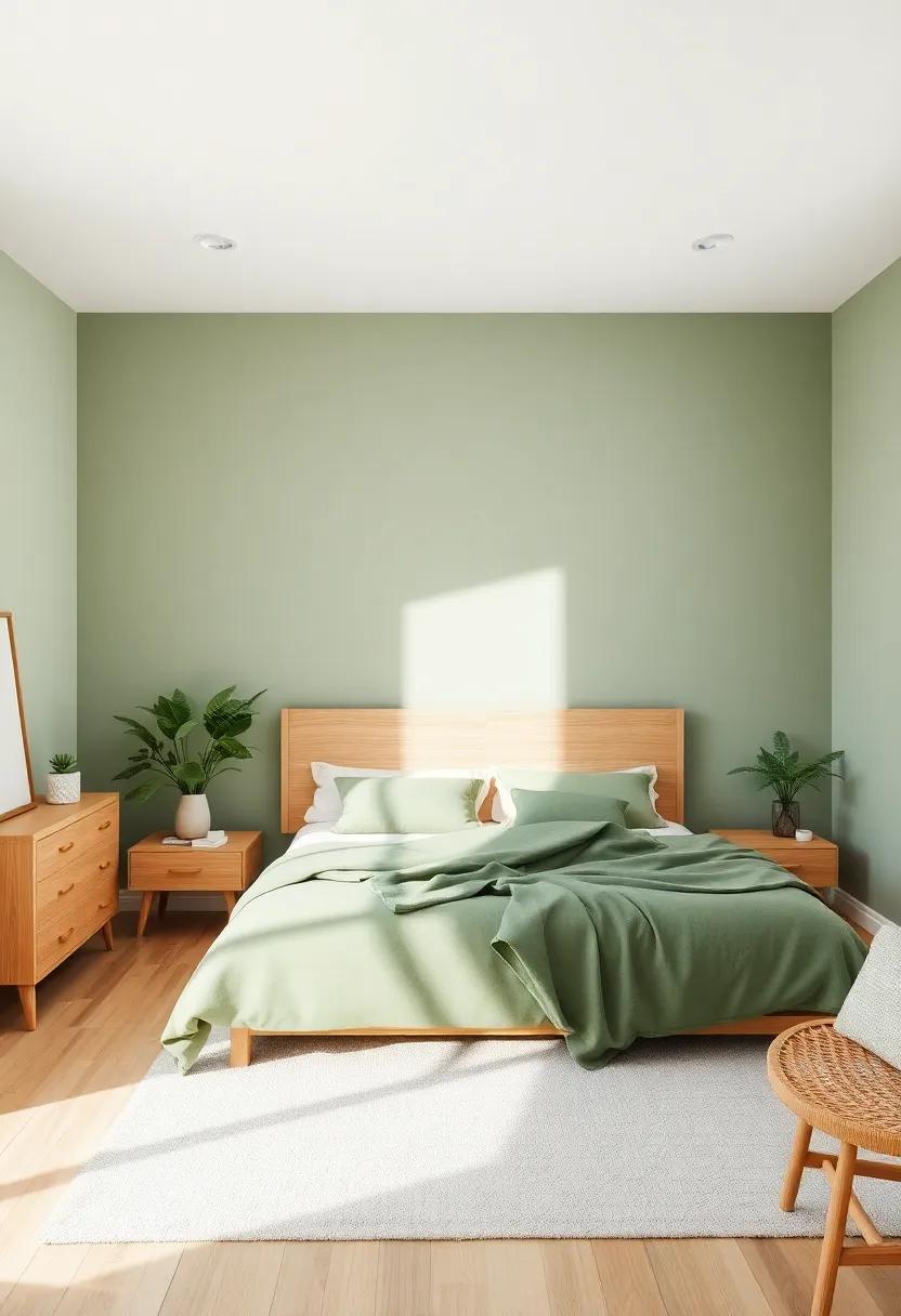
Creating a Cozy Retreat Using Muted Sage Green to Harmonize with Wood
Muted sage green creates an enchanting backdrop for any bedroom, notably when paired with light wood furniture. This soft hue evokes a sense of calm and tranquility, making it ideal for a restful retreat. By opting for sage green, you infuse the room with natural warmth and a layer of sophistication. The subtle sophistication of this tone serves as a perfect canvas, allowing your light wood pieces to shine without overwhelming the senses. Soft linen sheets and textured throw pillows in complementary earth tones can enhance the overall aesthetic, promoting a soothing ambiance.
To maximize the cozy effect, consider incorporating a variety of textures and materials. Natural fiber rugs, like jute or sisal, provide a tactile contrast to the smoothness of wooden furniture while grounding the space. Additionally, incorporating greenery, such as potted plants or fresh-cut flowers, will harmonize beautifully with the sage walls and wood tones. Here are some essential elements to consider:
- Accent colors: Soft whites, subtle creams, or warm beige
- Textures: cotton, linen, and wool for cushions and throws
- Decorative Elements: Wooden frames or clay pots to add rustic charm
Invoking Tranquility with Misty Gray to Accent Light Wood Furnishings

Choosing a hue that embodies serenity can transform your bedroom into a peaceful retreat. Misty gray strikes the perfect balance, offering a cool and subtle backdrop that highlights the natural warmth of light wood furnishings. This color invokes a sense of calm, making it an ideal choice for creating a soothing, restful environment.With its understated elegance, misty gray beautifully complements the organic textures of wood, allowing the grains and finishes to stand out. By pairing this soft shade with light wood, you not only enhance the aesthetic appeal but also foster a tranquil atmosphere.
To fully embrace this harmonious blend, consider incorporating the following elements into your design:
- Textiles: Soft, layered bedding in white or muted pastels can provide a cozy contrast
- Accessories: Incorporate natural fibers through rugs and curtains to tie the look together
- Art Pieces: Choose abstract or nature-inspired artworks in similar tones to enhance the calming vibe
When accessorizing, think about how the textures interact with your chosen palette. The end result will be a space that not only looks visually pleasing but also promotes relaxation and rejuvenation.
The Boldness of Charcoal Gray: A Striking Contrast with Light Wood
Charcoal gray is a majestic choice that imbues any space with sophistication and depth. Combining it with light wood furniture creates a compelling visual narrative that balances warmth with boldness. This juxtaposition invites a sense of tranquility while providing enough contrast to awaken the senses. The richness of charcoal gray draws the eye, allowing the lighter tones of wood to shine without overwhelming the aesthetic. It is indeed a statement color that whispers elegance, making it a perfect backdrop for artwork or decorative pieces, thus enhancing your bedroom’s character.
Incorporating charcoal gray within your bedroom can be achieved through various means, all of which contribute to a cohesive design scheme. Consider the following elements to harmonize your space:
- Pillows and Throws: Accent with soft grays to tie in the wall color.
- Artwork Frames: Use dark frames to highlight the contrast between the wall and furniture.
- Rugs: A patterned rug with hints of gray can anchor the space beautifully.
- Accent Chair: A plush charcoal chair can provide a cozy reading nook while enhancing the palette.
To further illustrate how charcoal gray pairs beautifully with light wood, consider the following comparison:
| Element | Impact |
|---|---|
| Gray Walls | Create a cozy, elegant atmosphere. |
| Light Wood Furniture | Add warmth and balance, preventing the room from feeling too dark. |
| Soft Textiles | Introduce texture and comfort, enhancing the layered look. |
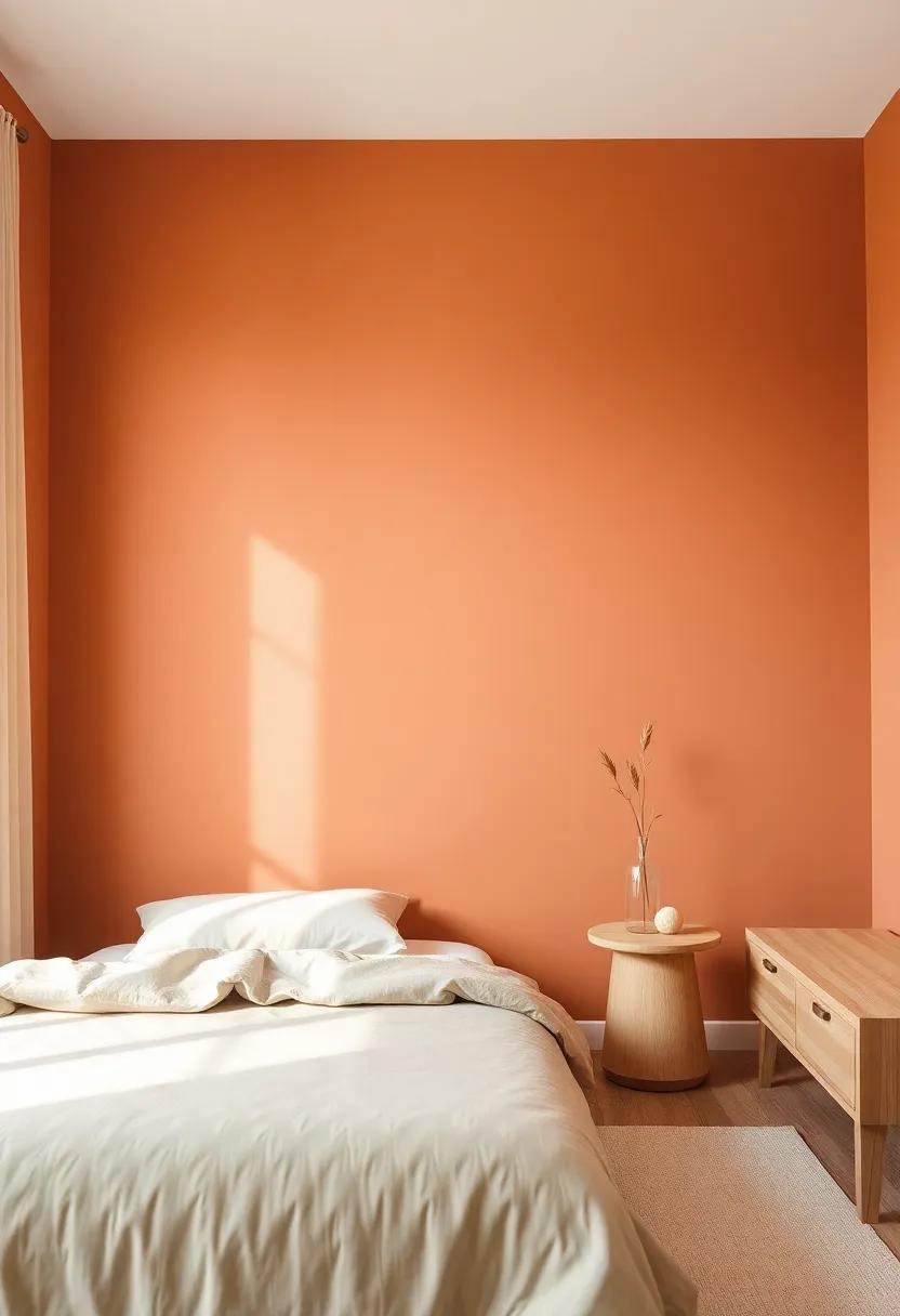
Infusing energy with Soft Coral Hues and Their Relationship to Wood
The juxtaposition of soft coral hues with the warm tones of light wood furniture creates an inviting atmosphere that breathes life into any bedroom. The gentle blush of coral serves to energize, while maintaining a sense of tranquility, making it an ideal partner for light wood pieces. This combination not only enhances the aesthetics of the space but also fosters a harmonious connection between the elements, ensuring all aspects of the room feel cohesive and balanced. Whether opting for a feature wall painted in a subtle coral tone or integrating coral accents through textiles and decor, the impact can be transformative.
Understanding the relationship between these colors can inform your choices in decor and furnishings.Consider the following advantages of integrating soft coral hues with light wood:
- Warmth and Comfort: Coral’s warm undertones complement the natural warmth of wood, creating a cozy retreat.
- Visual Interest: This pairing adds visual depth, drawing the eye and creating a focal point in the room.
- Versatility: Soft coral pairs well with a range of accessories, from greens to whites, allowing for varied decor styles.
To illustrate how you might effectively apply this combination in your design, consider the following table:
| Feature | Coral Palette Option | Wood Type Compatibility |
|---|---|---|
| Accent Wall | Soft Peach Coral | Light Maple |
| Textiles | Muted Coral Stripes | Birch |
| Decor Items | cotton Coral | Pine |
Timeless Elegance with Crisp White Walls Enhancing Light Wood Details
Crisp white walls breathe life into any space, creating a serene backdrop that beautifully accentuates the natural warmth of light wood details. The harmonious relationship between these two elements fosters a sense of tranquility reminiscent of a breezy coastal retreat. With an emphasis on simplicity and sophistication, the clean lines of light wood furniture stand out against the backdrop of white, inviting light into the room and making it feel larger and more open. This palette not only enhances the aesthetic appeal but also evokes feelings of calmness and clarity, essential for a peaceful bedroom sanctuary.
To achieve this sophisticated look, consider incorporating various textures through your decor elements. By selecting furnishings in natural materials, such as wicker, linen, and even subtle metal accents, you can add depth and interest to the overall design. Here are some creative ways to maintain the elegant balance:
- Textured Throws: Soft knitted throws or linen blankets can add warmth while enhancing the cozy appeal.
- Wood Accents: Choose light wood shelves or picture frames to tie everything together without overpowering the white walls.
- Greenery: indoor plants can serve as natural decor, bringing a touch of life and color against a neutral backdrop.
Charming Pastels: The Subtle Touch of lavender in a Light Wood Bedroom
In the world of interior design, the gentle hue of lavender serves as a perfect counterpoint to light wood furniture, creating a soothing atmosphere that promotes relaxation and tranquility.This charming pastel shade introduces a subtle yet impactful pop of color that enhances the organic warmth of light wood. By incorporating lavender elements, such as wall paint or decorative accents, you can create a harmonious environment that feels both inviting and serene. The interplay of lavender with light wood not only adds visual interest but also cultivates a balanced space that encourages restful slumber.
To maximize the effect of lavender against light wood, consider integrating complementary accents that echo the calming essence of the color. Items such as natural textiles, soft lighting, and botanical elements work beautifully to enhance the overall aesthetic. Here are some suggestions to further elevate your lavender-themed bedroom:
- Throw pillows in varying shades of lavender to create depth.
- artwork that features lavender tones, enhancing the walls’ allure.
- Bed linens with subtle lavender patterns or textures for a cohesive look.
| Accent elements | Effect on the Space |
|---|---|
| Soft lavender curtains | Diffuses natural light, creating a dreamy ambiance |
| Lavender-scented candles | Adds calming fragrance and enhances relaxation |
| Wall decals | Adds playful character without overwhelming design |
The Gentle Touch of Cream: Harmonizing Softness with Natural Elements
In the world of interior design, the delicate harmony between colors and textures can create an inviting atmosphere, especially in a bedroom. When paired with light wood furniture, creamy hues offer a soothing backdrop that enhances the natural appeal of the wood grain.Shades like soft ivory, pale beige, and whispering cream can envelop the space in warmth, providing an understated elegance that promotes relaxation. These tones invite you to unwind, allowing the gentle touch of cream to shine as an essential element, infusing tranquility and calmness into your sanctuary.
To further enhance the soft ambiance of your bedroom,consider incorporating natural elements that resonate with the gentle cream palette. Think about adding textured fabrics such as linen and cotton in complementary shades, bringing depth and comfort to the space. Incorporating plants with lush green foliage can invigorate the creamy backdrop and create a pleasing contrast that brings the outdoors in. here are a few ideas to harmonize your bedroom decor:
- Layering with Textiles: Use throws and cushions in soft earthy tones.
- Natural Décor: Introduce woven baskets or wooden accents to resonate with the light wood furniture.
- Artwork: Choose pieces that include soft colors or natural scenes for a cohesive look.
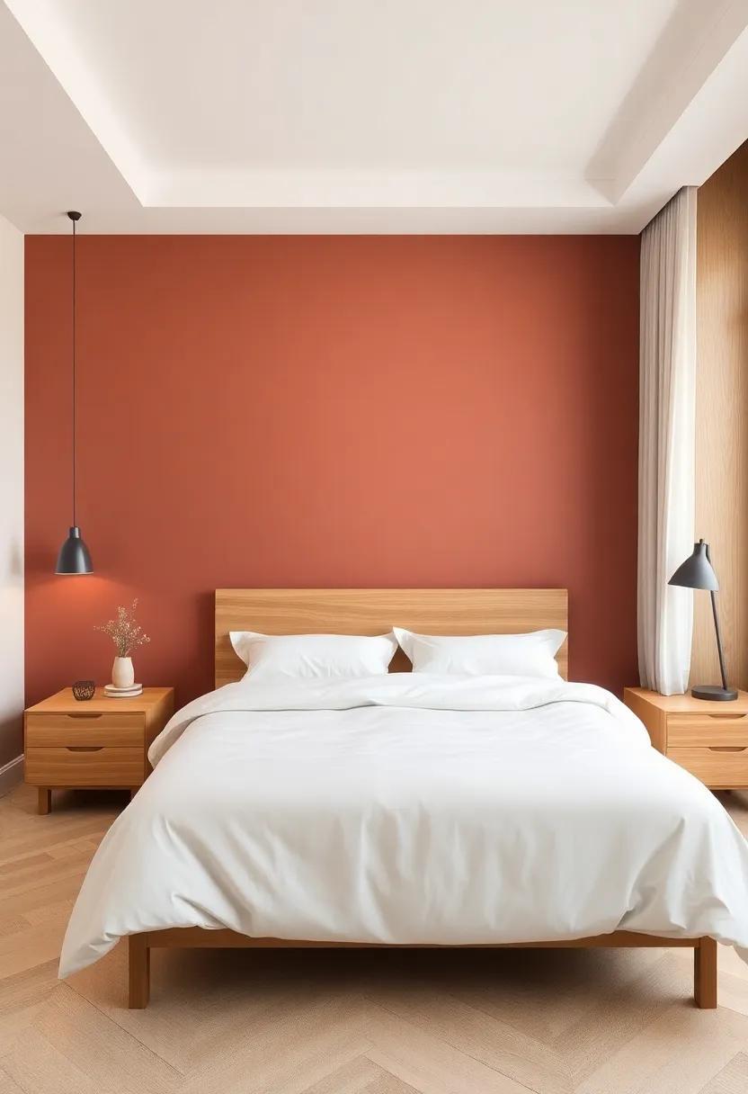
Nature’s Inspiration: Earthy Terracotta to Create a Warm Ambiance
The rich, warm hues of terracotta draw their inspiration from the very earth beneath our feet, evoking a sense of comfort and grounding. This color not only complements light wood furniture beautifully but also creates an inviting atmosphere that encourages relaxation. By painting your bedroom walls in soft terracotta tones, you bring a touch of the natural world indoors, allowing for a space that feels both tranquil and rejuvenating. The earthy undertones infuse the room with a cozy embrace, making it an ideal backdrop for restful nights and serene mornings.
To achieve a harmonious balance, consider pairing terracotta with a selection of complementary accents that enhance its natural charm. Here are some suggestions for bringing the palette to life:
- Creamy whites: Crisp and clean, these shades offer a soft contrast to terracotta.
- Muted greens: Shades like sage or olive introduce a refreshing, organic feel.
- Rustic browns: Deep browns can add depth and richness, grounding the color scheme.
Using a combination of these colors,furniture,and textiles will create a multi-dimensional space that feels cohesive and inviting. Below is a simple table that showcases some harmonious color pairings for inspiration:
| Color | Mood |
|---|---|
| Terracotta | Warmth & Comfort |
| Creamy White | Freshness |
| Muted Green | Natural & Serene |
| Rustic Brown | Depth & Stability |
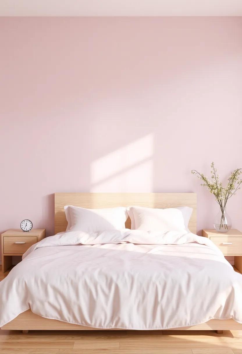
Whispers of Dusty Pink: A Romantic contrast to Light Wood Interiors
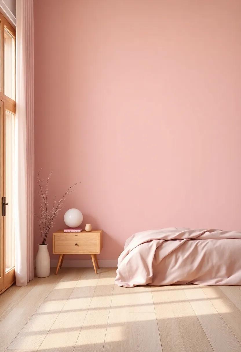
in the realm of interior design, color choices play a crucial role in setting the mood and atmosphere of a space, particularly in intimate rooms like bedrooms.The soft, delicate hue of dusty pink emerges as a captivating choice that pairs beautifully with light wood furniture. This shade exudes a sense of warmth and tranquility, offering a romantic contrast that brings depth to the light and airy qualities of natural wood. Its subtle undertones create a dreamy backdrop, amplifying the inviting essence of your furniture while fostering a serene haven conducive to relaxation and rest.
When integrating dusty pink into your bedroom, consider the following elements to enhance the aesthetic:
- Accent Walls: Create a single accent wall painted in dusty pink to serve as a focal point against lighter hues.
- Textiles: Incorporate dusty pink in your bedding or curtains, allowing it to soften the overall look and tie together the room.
- Accessories: Add decorative elements like cushions or artwork that reflect hints of dusty pink to unify the color palette.
The combination not only elevates the charm of light wood but also cultivates a romantic atmosphere, making the bedroom an enchanting retreat.
Cool and collected: Utilizing Frosty Mint for a Refreshing Bedroom Feel
Imagine stepping into your bedroom and feeling an instant wave of calm wash over you. Incorporating a frosty mint hue into your walls creates a serene atmosphere that perfectly complements light wood furniture. This cool, refreshing color not only brightens the space but also seeks to establish a visual harmony that promotes relaxation and tranquility. The crispness of mint adds a breath of fresh air and encourages peaceful sleep while highlighting the organic beauty of wood textures.
To enhance the frosty mint aesthetic, consider pairing it with accessories and décor elements that echo nature. Here are a few ideas to harmonize with this cooling shade:
- Soft white linens: Elevate the freshness of mint while maintaining a serene vibe.
- Natural textures: Incorporate rattan or jute to add warmth and depth.
- Accent colors: Use coral or dusty pink for a subtle pop that still feels soft and inviting.
- Greenery: add plants to bring life to your space and complement the minty tones.
Consider the following combinations to find the perfect balance:
| accent Color | Effect |
|---|---|
| Soft Peach | Creates warmth and a gentle contrast. |
| Cool Gray | Adds sophistication while keeping the palette light. |
| Powder Blue | Enhances tranquility and flows naturally with mint. |
Artful Accents: Deep Navy Walls That Complement Light Wood Furniture
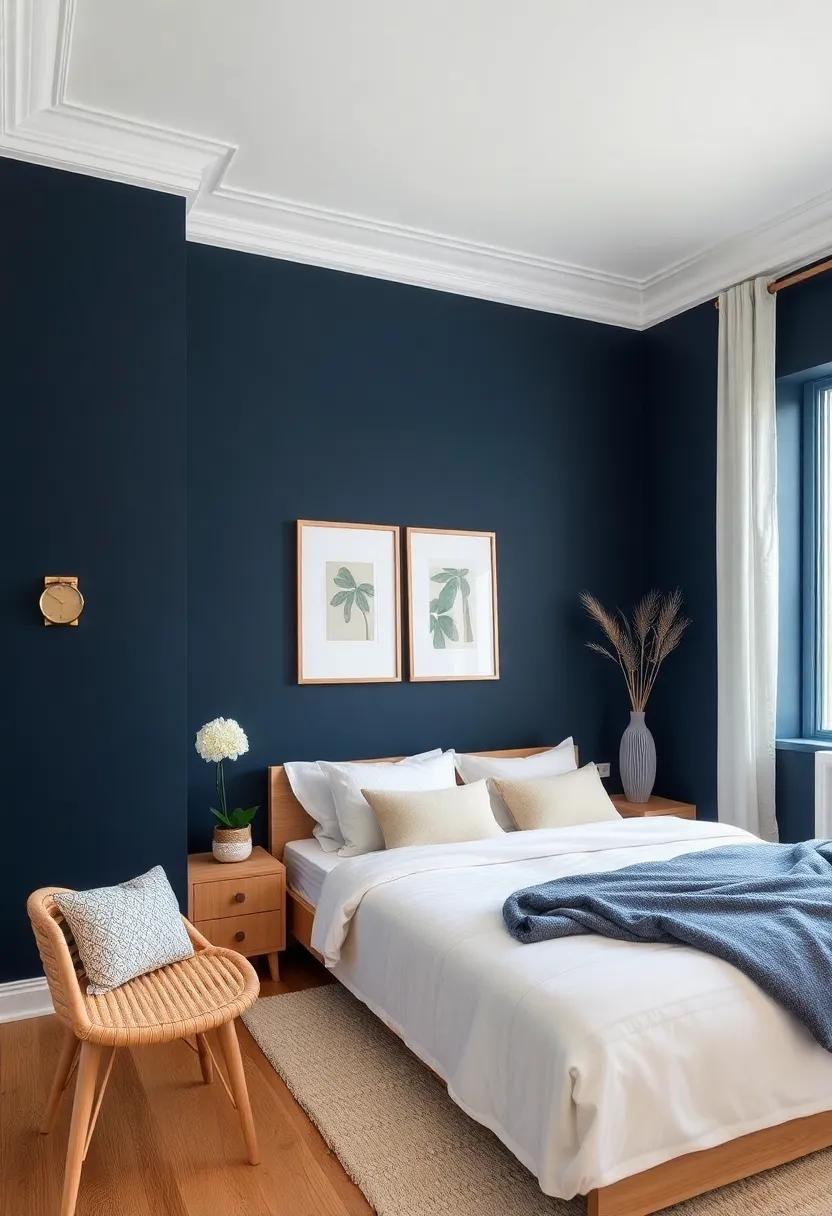
Deep navy walls create a stunning backdrop that serves to highlight the natural beauty of light wood furniture. The rich, saturated hue of navy invokes a sense of calm and sophistication, making it an ideal choice for a tranquil bedroom atmosphere. with its deep tone, navy allows the soft, warm tones of light wood to shine, enhancing the furniture’s grain and texture. to achieve a cohesive look, consider incorporating accessories that echo the navy theme, such as:
- Navy throw pillows to add layers of comfort
- Textured blankets that soften the overall aesthetic
- Artwork featuring navy hues to create a focal point
Furthermore, the interplay between deep navy and light wood can be elevated through creative lighting choices. Opt for warm white or soft yellow bulbs to cast a gentle glow that contrasts beautifully with the darkness of the walls while enhancing the natural warmth of the wood. Mixing in metallic or glass accents can also add a modern touch, making the space feel both inviting and contemporary. Consider these additional elements to unify the look:
| Element | Effect |
|---|---|
| Brass Fixtures | Warmth and elegance |
| Glass Vases | Lightness and transparency |
| natural Textiles | comfort and softness |
Bringing the Outdoors In with Light Olive Green and Its Harmonious Vibe
Transforming your bedroom into a serene retreat can be effortlessly achieved with the inclusion of light olive green. This soft, muted hue reflects the beauty of nature and creates a tranquil atmosphere, making it a perfect backdrop for your light wood furniture. You can enhance this peaceful vibe by pairing light olive green walls with *natural textiles* and *earthy decor*. Incorporating elements such as:
- Cozy Throws: Use fabric in complementary soft tones like cream or beige to keep the feel relaxed.
- Soft Lighting: Opt for warm-toned bulbs to enhance the soothing qualities of olive green.
- Botanical accents: Add indoor plants or botanical prints to reinforce the connection with nature.
The warmth of light wood furniture beautifully complements the calmness of this green tone, creating a harmonious balance in your space. A well-thought-out color palette can take your room from ordinary to remarkable, especially when you consider how furniture and wall colors work together. For a cohesive look, try using an accent table or decor in a darker green or muted tone that echoes the primary shade.here’s a simple guide on pairing light olive green with other elements:
| Element | Recommended Colors | Textures |
|---|---|---|
| Accent Decor | Dusty Rose, warm taupe | Soft fabrics, Wood |
| Bedding | Whites, Light Grays | Cotton, Linen |
| Rugs | Beige, Natural fibers | Woven, Plush |
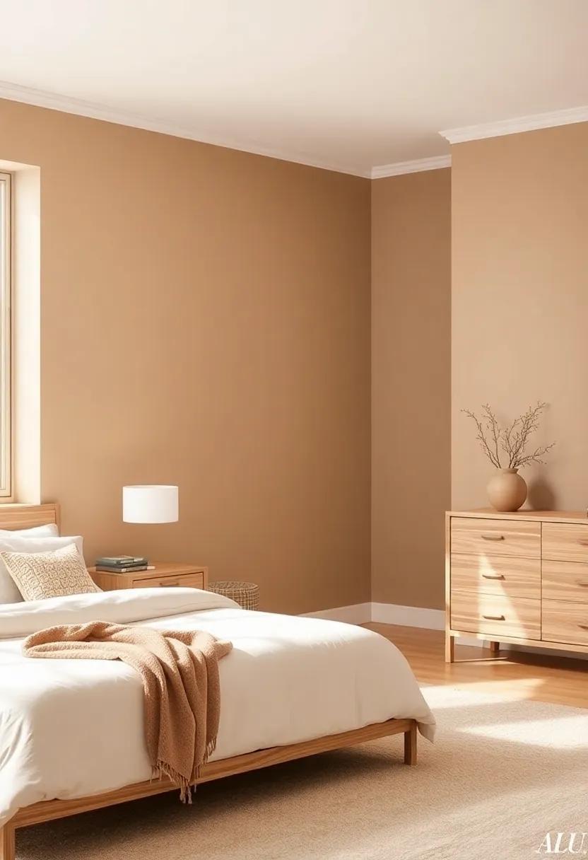
Rustic Chic: How Warm Taupe Balances the Beauty of Light Wood
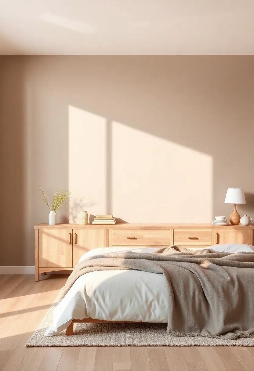
In the world of interior design, striking a balance between different elements is key to creating a harmonious space. When it comes to light wood furniture, warm taupe emerges as a perfect companion, enhancing the natural beauty of wood while introducing a comforting and inviting atmosphere. With its subtle earthy tones, taupe effortlessly softens the starkness of light wood, creating a seamless transition between surfaces that feels both intentional and organic. This color works particularly well in bedrooms, where tranquility and relaxation are paramount.
To fully appreciate the impact of warm taupe on your bedroom, consider the following benefits it offers:
- Versatility: pairs beautifully with various decor styles, from modern to rustic.
- Warmth: Brings an inviting glow that complements the natural hues of wood.
- Contrast: Creates a subtle yet striking contrast that highlights the unique grain patterns of light wood.
Additionally, here’s a simple breakdown of complementary color options to enhance your design:
| Color | Description |
|---|---|
| Soft White | Brightens the space while maintaining a cozy vibe. |
| Dusty Blue | Adds a touch of calmness,reminiscent of serene skies. |
| Sage Green | Infuses a natural element, echoing the outdoors. |
Sunset Hues: Mellow Yellows That Brighten and Lift Your Bedroom Aesthetic
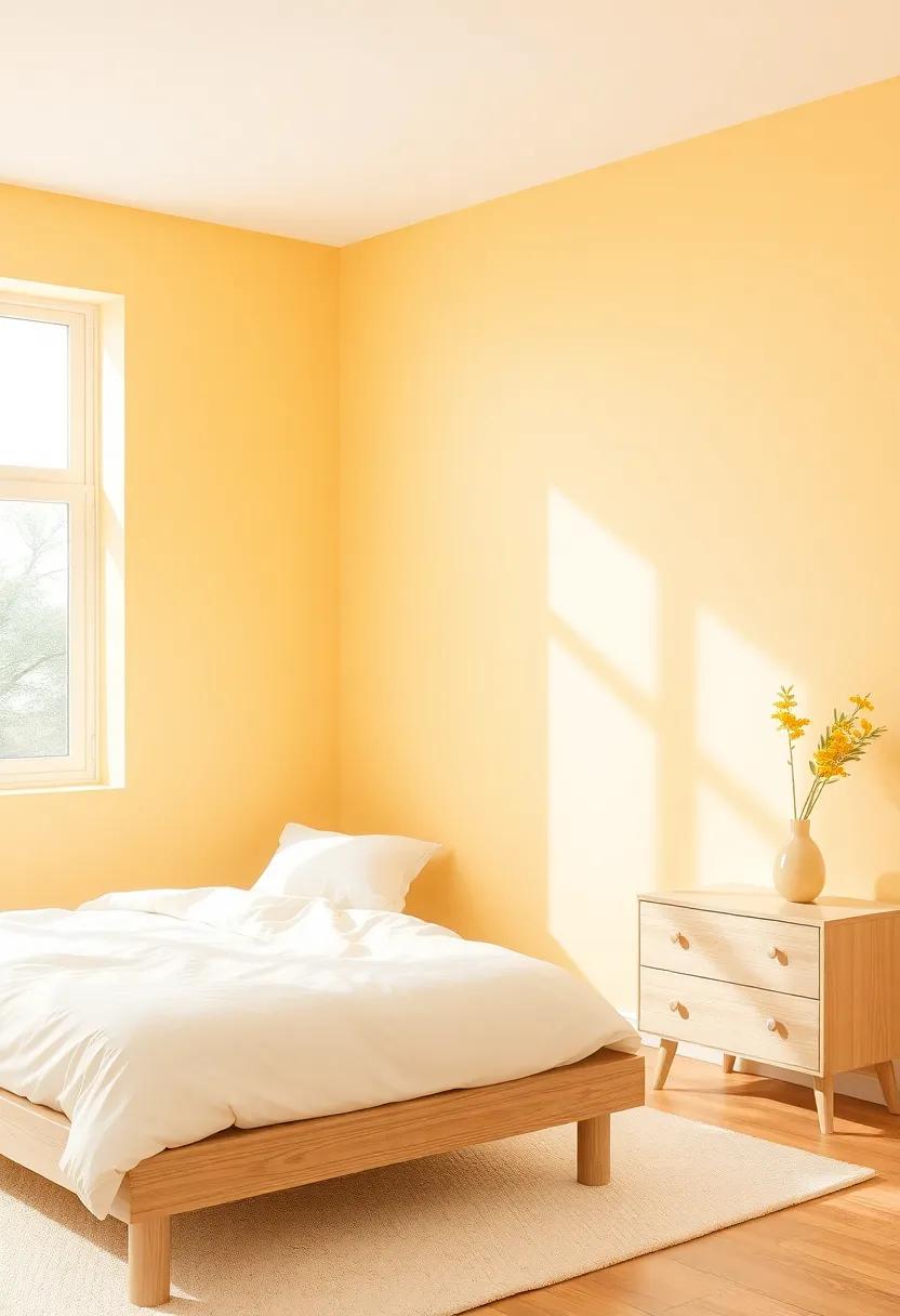
Infusing your bedroom with mellow yellows can transform it into a sun-kissed retreat that radiates warmth and positivity. These soft, buttery shades not only harmonize beautifully with light wood furniture but also evoke the serene beauty of sunsets gently spilling their golden glow.Consider these captivating options to elevate your space:
- Buttercup Yellow: A soft yet vibrant hue that adds a playful touch.
- Pastel Lemon: This light,airy shade brightens the room without overwhelming it.
- Golden Beige: A subtle blend that complements natural wood grains effortlessly.
Painting your bedroom in these gentle tones creates a tranquil atmosphere, inviting relaxation and comfort. To maximize this effect, accentuate with earthy tones in your decor—think terracotta or sage green pillows, and woven textures that add depth and warmth.Below is a simple chart outlining how these colors interact with light wood tones:
| Color Shade | Effect on Room | Complementing Texture |
|---|---|---|
| Buttercup Yellow | energetic and welcoming | woven cotton or linen |
| Pastel Lemon | Fresh and uplifting | Soft textures like velvet |
| Golden beige | Cozy and soothing | Natural fibers like jute |
Vintage Vibes: The Allure of Muted Turquoise Paired with Natural Wood
The charm of muted turquoise is undeniable, especially when it intertwines with the warmth of natural wood. this color exudes a serene elegance, evoking feelings of calmness and tranquility, making it a perfect backdrop for a peaceful bedroom retreat.When paired with light wood furniture, it creates a harmonious and inviting atmosphere, where the two elements enhance each other’s beauty. The gentle tone of turquoise adds a breath of freshness, while the natural grain of the wood brings depth and character to the space.
Incorporating these elements can be achieved through various design techniques, including:
- Accent Walls: Choose one wall to apply a subtle coat of muted turquoise, allowing the other walls to remain a soft white or cream.
- Bedding and Accessories: Use decorative items like cushions, throws, or curtains in complementary shades of turquoise to tie the room together.
- Artwork and Décor: Select pieces that showcase the color palette, enhancing the overall cohesive feel.
To visualize the enchanting combination of these colors, refer to the table below:
| Element | Color/Material | Effect |
|---|---|---|
| Walls | Muted Turquoise | Tranquil and Refreshing |
| Furniture | Natural Wood | Warm and Inviting |
| Textiles | Turquoise Accents | Cozy and Coordinated |
Celebrating Modern Minimalism with Soft Grays and Light Wood Warmth
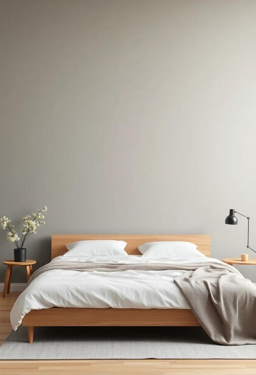
Embracing modern minimalism is all about achieving a serene and uncluttered environment, where every element speaks to simplicity and elegance. Walls painted in soft grays create a subtle backdrop that enhances the natural beauty of light wood furniture. This gentle hue complements the warm undertones of oak, pine, or birch, allowing the furniture to stand out while providing a perfect canvas for decorative elements. For a more harmonious effect, consider incorporating textures in fabrics and accessories that echo this calming palette, such as:
- Linen curtains for a light, airy feel
- Soft wool throws to add warmth and comfort
- Ceramic accent pieces that bring a touch of artfulness
By choosing light gray tones with varied intensities, you can create different moods that elevate your space. As a notable example, a cool, misty gray can instill a sense of tranquility, while a warmer, taupe-infused gray can evoke a welcoming ambiance. Pairing these shades with light wood creates a visually balanced composition that feels both modern and timeless. Below is a simple table showcasing ideal gray shades to consider, along with their corresponding moods and styles:
| Shade | Mood | Style |
|---|---|---|
| Cool Mist | Calm | Contemporary |
| warm Taupe | Welcoming | Scandinavian |
| Softer Gray | Inviting | Minimalist |
To Wrap it Up
in the grand symphony of interior design, every element plays a vital role, and perhaps none is as influential as the color of your walls. As we’ve explored the interplay between light wood furniture and harmonious wall colors, it becomes clear that the right shades can elevate a bedroom from mere functionality to a serene sanctuary.
Whether you opt for soft pastels that whisper of tranquility, vibrant hues that spark inspiration, or timeless neutrals that anchor your space, the choices are as diverse as the personalities they reflect. The key lies in understanding the mood you wish to create and how each color interacts with the textures and tones of your furniture.
As you embark on this journey of color selection, remember that your bedroom is more than just a place to rest—it’s a canvas for your dreams, a haven for relaxation, and a reflection of who you are.Let each brushstroke echo your unique style, and watch as your space transforms into a harmonious retreat that truly feels like home. So go ahead, embrace the colors that speak to you, and create a bedroom that not only complements your light wood furniture but also enhances your everyday life.