Mastering the Art of Living Room Color Harmony
The living room is often considered the heart of the home, a place where families gather to relax, unwind, and connect. As such, it’s important to create a space that is not only comfortable and inviting, but also visually appealing. One way to achieve this is through mastering the art of living room color harmony – choosing the perfect combination of colors that work together seamlessly to create a cohesive and harmonious look.
From calming neutrals to bold, vibrant hues, the colors you choose for your living room can have a profound impact on the overall feel of the space. By understanding the principles of color theory and learning how to pair different shades and tones effectively, you can create a room that exudes style and sophistication. In this article, we will explore some tips and tricks for mastering the art of living room color harmony, so you can create a space that not only looks great but also feels comfortable and welcoming.
Creating a Welcoming Atmosphere with the Right Colour Combination for Living Room
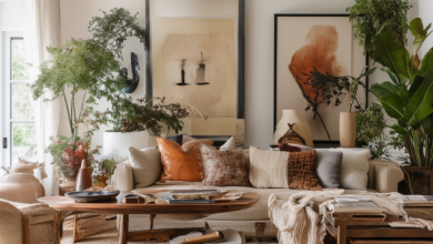
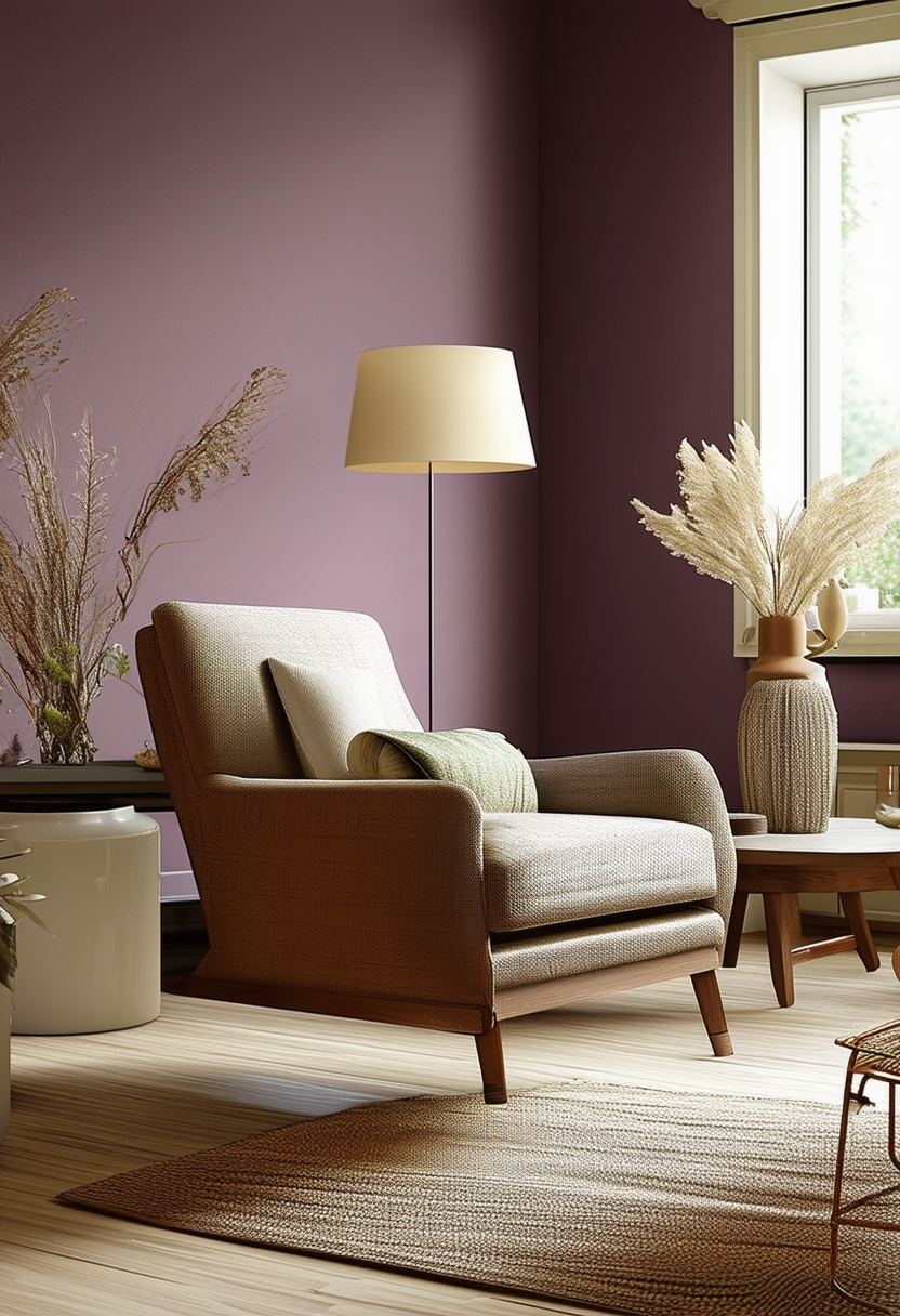
Choosing the right colour combination for your living room is essential in creating a welcoming atmosphere for both yourself and your guests. One key to mastering the art of living room colour harmony is to start with a neutral base. Shades of white, beige, or grey can help create a calm and soothing environment that serves as a backdrop for bolder accent colours.
Once you have a neutral base established, it’s time to add in pops of colour to bring life and personality to the room. Consider using a colour wheel to find complementary or analogous colours that will work well together. For example, pairing a soft blue with a warm yellow can create a harmonious and balanced look.
Don’t be afraid to experiment with different shades and tones to find the perfect colour combination that suits your style and taste. Remember that lighting can also play a significant role in how colours appear in a room, so be sure to test your chosen palette in various lighting conditions before making a final decision.
Balancing Bright and Neutral Tones for a Harmonious Look
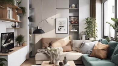
When designing your living room, it’s crucial to strike a balance between bright and neutral tones to create a harmonious look that exudes warmth and style. By incorporating a mix of vibrant hues and subtle shades, you can achieve a visually appealing space that feels inviting and comfortable for both you and your guests.
To master the art of living room color harmony, consider the following tips:
-
- Start with a Neutral Base: Begin by painting your walls in a soft, neutral color such as beige, grey, or cream. This will provide a versatile backdrop that can be easily paired with both bright and bold accents.
-
- Add Pops of Bright Color: Introduce pops of color through accessories such as throw pillows, rugs, artwork, and accent furniture. Opt for hues like teal, mustard yellow, or coral to add personality and energy to the space.
-
- Balance with Neutrals: To prevent the room from feeling overwhelming, balance out the bright colors with plenty of neutral elements. Incorporate white or cream-colored curtains, light wood furniture, and metallic accents to create a sense of cohesion.
| Neutral Tones | Bright Tones |
|---|---|
| Beige | Teal |
| Grey | Mustard Yellow |
| Cream | Coral |
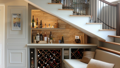
Incorporating Statement Pieces to Elevate Your Living Room’s Colour Palette
One of the key elements in achieving a harmonious colour palette in your living room is the use of statement pieces. These pieces serve as focal points that can tie the room’s colours together, creating a cohesive and visually appealing space. Incorporating statement pieces such as a bold, vibrant rug or a striking piece of artwork can add depth and interest to your room’s colour scheme.
When choosing statement pieces, consider the existing colours in your living room and select items that complement or contrast with these hues. For example, if your room features neutral tones like beige and cream, opt for a statement piece in a bold colour like deep blue or emerald green to add a pop of contrast. Additionally, consider the texture and material of the statement piece to enhance the overall aesthetic of the room.
To further enhance the impact of your statement pieces, consider incorporating smaller accent pieces in a similar colour palette. This can help to tie the room together and create a cohesive look. For example, if you have a statement piece in a rich shade of burgundy, consider adding throw pillows or a decorative vase in a similar hue to create a sense of balance and unity in the room.
Utilizing Texture and Patterns to Add Depth to Your Living Room Colour Scheme
Incorporating a variety of textures and patterns into your living room color scheme is a surefire way to add depth and visual interest to the space. Mixing different textures such as velvet, faux fur, and woven materials can create a tactile experience that is both inviting and luxurious. Pairing these textures with bold patterns like geometric prints, stripes, or floral motifs can elevate the overall look of the room.
When selecting textures and patterns for your living room, consider the color palette you have chosen. Opt for textures and patterns that complement the colors you have selected for your walls, furniture, and accessories. For example, if you have a neutral color scheme, consider incorporating a plush velvet sofa in a rich jewel tone to add warmth and depth to the space. Experiment with different combinations until you find the perfect balance of texture and pattern that ties the room together.
To create a harmonious look, mix and match different textures and patterns in varying scales. For instance, pair a large-scale floral wallpaper with a small-scale geometric rug to create visual interest without overwhelming the space. Incorporating a mix of textures and patterns in different elements of the room, such as throw pillows, curtains, and rugs, will help to create a cohesive and coordinated look that is visually appealing. Remember, the key to mastering the art of living room color harmony lies in experimenting with different textures and patterns to create a space that is both stylish and inviting.